
Creative Direction for the Clearer Eyes™, with a focus on visual evolution and identity refinement to better reflect its clean, clinical, and trustworthy values.
Introduction
Clearer Eyes™ is a UK-based health supplement brand focused on supporting long-term eye health through science-backed ingredients. With a commitment to clarity, wellness, and daily rituals, Clearer aims to position itself as an essential part of a modern, health-conscious lifestyle.
Deliverables
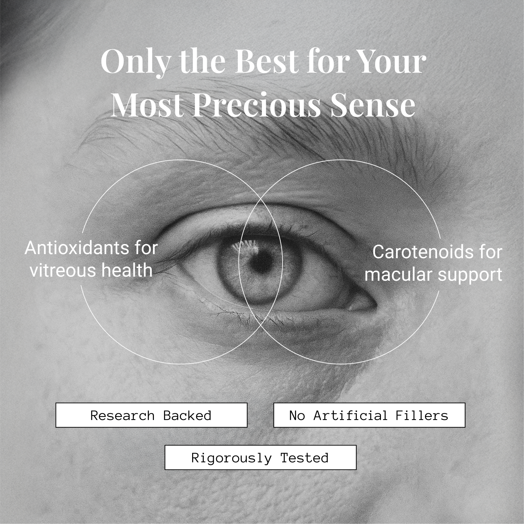
Creative direction for the brand included evolving and modernising its visual identity to meet today’s standards. This included refreshing the look across social media and marketing assets, and introducing clean, consistent visual storytelling. The result is a more polished, trustworthy, and contemporary brand presence across all digital touchpoints.


Supplement Ingredients Visualisation
To convey scientific clarity, cleanliness, and trust, a visual system was developed using petri dishes as the consistent framing device. This approach reinforces the brand’s clinical aesthetic and communicates transparency and credibility.
The full set of AI-generated ingredient visuals has been designed for use across the website, blog, and social media, providing a cohesive and recognisable style whenever ingredients are referenced.